What about your project was most successful? Explain.
The part that I felt was the most successful were the print ads. According to me they looked professional in their composition and eye-catching.
What about your project was least successful?Explain.
I felt that my animated banner wasn't that creative compared to my other work. If my vision provided a better sight then I believe that i could have done a better job in animating the banner.
How did you manage your time during the project?
I did a bit by bit everyday and I also worked at home. So i was able to complete my summative inspite of my constant visits to the hospital.
What would you change about your work?
What I would change is my animated banner. I would definitely try to make a more complicated composition and integrate different effects to make it eye-catching. If I had more time I would have made a commercial ad instead of the animated banner.
What mark do you believe that you have earned on the project? Explain.
Considering the facts that I have take the initiative to complete all parts of the assignment, I believe that I would have got a pretty decent mark. I think I would have got 85% plus, as I have a mixture of excellent and okay-looking works. So I believe I have earned a 90% on the assignment.
Saturday, 16 June 2012
Thursday, 14 June 2012
Why I feel my logo looks better
.JPG) |
BEFORE |
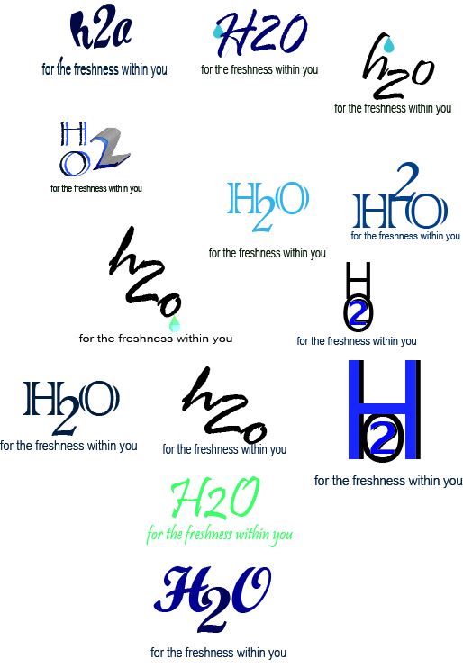
The style/feeling that I want my logo to convey.
 As
my logo is that of a refreshing, sea derived skin care cream, I want my logo to
convey the feeling of freshness. The feeling one gets when cool water trickles
down their face on a hot and humid day or a soft breezy day. By using the
Creams and scrubs H20 plus has to offer, the customer should feel the same
cool, breezy effect on their skin. An angelic glow of natural, enriched
skin. The consumers should be able to
feel the explosive coolness and the sweetness when the water trickles down their face
As
my logo is that of a refreshing, sea derived skin care cream, I want my logo to
convey the feeling of freshness. The feeling one gets when cool water trickles
down their face on a hot and humid day or a soft breezy day. By using the
Creams and scrubs H20 plus has to offer, the customer should feel the same
cool, breezy effect on their skin. An angelic glow of natural, enriched
skin. The consumers should be able to
feel the explosive coolness and the sweetness when the water trickles down their facePitch
Market Demographics of L'oreal
Recently even young girls wear make-up, as young as 12-13 years of age. L'oreal target young teens. Women after marriage give up make up, so they target these groups as well. Successful working women with high and middle income in the urban areas are their main target. In some religion (Muslim) make up isn’t allowed so it is hard to find a place in Saudi Arabia. Asia, Europe and America are their main targets.Climate is another important factor so it is not possible to use make up in hot weather.
HOW H2O PLUS AND L'OREAL COMMUNICATE TO THEIR SPECIFIC CLIENTELE
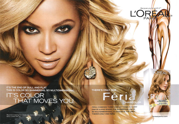
L'oreal is able to communicate to their clientèle by using famous actresses for their campaign and this is very effective to a certain level. Teens get attracted to these kinds of campaigning and they are very useful as these ads are very eye catching to the audience. They use 'compliments' technique in their advertising techniques. Their tag line "because you're worth it" makes a claim that we should be using the product for the high social status associated with it. All the actresses in l'oreal ads claim that they use that specific product cause they're worth it. Also their products are very costly and high quality. People nowadays have the tendency of thinking that the higher the price the better the quality. All these techniques can clearly take their message across.
H2O PLUS
H2O Plus on the other hand have a target between 25-39 year old, their ads aren't that attractive as the ones for L'oreal. They mostly concentrate on the refreshing aspect of the product. Their brand name isn't very popular and they don't have much commercial ads as l'oreal ( which explains its unpopularity.)While researching on this topic I just found a Japanese/Chinese (I'm not sure which one) ad. I haven't found any other commercial ads and they aren't able the message across as well as L'oreal. So this product is for those females who want to improve their natural beauty and give them refreshing looks.For someone who believes in the quality of the product and its natural ingredients rather then the short term stunning look. Their products are really costly and have good quality. But they don't have enough customers to get their message across.So these products are usually bought by female customers who care about the natural enrichment of their skin rather than buying chemical make up products that gradually ruins the natural glow of their skin.
Market Demographic of H2OPlus
H2O Plus products are positioned in
the marketplace in the prestige category, made to be appealing to the prized 25-39 year
old urban professional female demographic, This is also influenced by the their interest in personal appearance, Focusing on money rather than quality and growing disposable income.The H2O Plus brand identity is distinctive in its use of unique approach to
product textures, colours, and fragrance as well as its distinctive minimalist
approach to packaging and retail environment. The Company's products are priced
competitively in the prestige category. So H2O Plus is highly priced because they focus on their quality and its effectiveness.
Wednesday, 13 June 2012
Good Brand: Nike
The Nike brand is considered a highly effective
brands across many disciplines. Nike is a major traded footwear, clothing,
sports equipment seller based in the US. It is the world’s leading supplier of
athletic shoes and major manufacturer of sports equipment. The brand alone is
worth $10.7 billion making it the most valuable brand among sport businesses.
‘Nike’ means the Greek goddess of victory. Both businesses professionals and
consumers consider Nike as well established and well respected. Nike has
contracted with more than 700 shops around the world and has offices located in
45 countries outside the United States. Most of the factories are located
in Asia including --Indonesia
- China
- Taiwan
- India
- Thailand
- Vietnam
- Pakistan-
Philippines
- Malaysia
The responsible agency's profile
W+K is
an independently owned American advertising agency best known for
its work for Nike. Founded by Dan Wieden and David Kennedy,
and its headquarters is in Portland, Oregon. It is one of the largest
independently-owned advertising agencies in the world.
Examples of the brand in use
Examples of the brand in use
Nike Air Max
|
 |
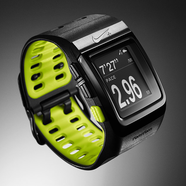
Nike+ Sportwatch GPS
(With Sensor)
|
Rebrand Personality
 Her voluptuous lips would be a shade of pink,
scattered with speckles of moisture. Overall, a stunning female between 20-40 years of age with a naturally beautiful personality and grace.
Her voluptuous lips would be a shade of pink,
scattered with speckles of moisture. Overall, a stunning female between 20-40 years of age with a naturally beautiful personality and grace.Current Brand personality
With the name H2O, I think it would definitely be a male. I can’t classify him into any race/culture, but if I'm asked to specify culture, it would be one of those tanned American men. He would be an extreme clean freak, with too clean skin. His skin wouldn't be having a smooth texture; it would be really dry from taking too many showers (maybe four times a day). I picture him dressed professionally, but it wouldn't be perfect. I mean he would be wearing an expensive suit but its arms would be long or it would be loose on him. He would get a professional hair but it wouldn't somehow suit his face or profile. His teeth would be really white/clean. He would be having a medium built body and would have blonde hair. His eyes would be a shade of teal and he would be having a face with a strong bone structure. He would be happy with his nearly perfect life but it wouldn't be something that he wishes/desires for. So overall we can say that H2O Plus would be an average looking male, with a professional profile and freaky clean life.
Rationale: H2O Plus
RATIONALE
PRODUCT- H2O PLUS
COSMETICS
H2O
Plus is probably a brand that no one has heard of but apparently the product is
more effective and ‘skin- loving’ than the other skincare products out there. Product wise, H2O products can be compared to other big cosmetic companies out there. It’s only after use that one recognises the refreshing and enriching effect of
the product. The main drawback I see is its logo and its advertising campaigns.
The
reasons why I think this company needs a rebrand are the following:-
·
The letters/numbers aren’t properly
spaced.
·
The plus sign and the swirly line just
don’t match with the H2O symbol
·
‘sea-derived skincare’ just don’t sound
right. Makes it more vulnerable to suspicions and criticism.
·
Overall appearance of the logo isn’t eye
appealing(it looks crappy)
·
Confusing at first sight- whether the
product is made from pure water (H2O)? Is it water proof? Does it cause skin irritation
(sea derived)? and many other questions.
Subscribe to:
Comments (Atom)


