The Art of Simplicity
Sunday, 28 April 2013
Saturday, 16 June 2012
Reflection
What about your project was most successful? Explain.
The part that I felt was the most successful were the print ads. According to me they looked professional in their composition and eye-catching.
What about your project was least successful?Explain.
I felt that my animated banner wasn't that creative compared to my other work. If my vision provided a better sight then I believe that i could have done a better job in animating the banner.
How did you manage your time during the project?
I did a bit by bit everyday and I also worked at home. So i was able to complete my summative inspite of my constant visits to the hospital.
What would you change about your work?
What I would change is my animated banner. I would definitely try to make a more complicated composition and integrate different effects to make it eye-catching. If I had more time I would have made a commercial ad instead of the animated banner.
What mark do you believe that you have earned on the project? Explain.
Considering the facts that I have take the initiative to complete all parts of the assignment, I believe that I would have got a pretty decent mark. I think I would have got 85% plus, as I have a mixture of excellent and okay-looking works. So I believe I have earned a 90% on the assignment.
Thursday, 14 June 2012
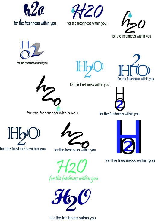
Why I feel my logo looks better
.JPG) |
BEFORE |
Subscribe to:
Comments (Atom)


